
Unlock the power of technical analysis with this deep dive into the types of chart patterns every trader should know. From trend continuations to reversals and bilateral setups, this guide reveals 40+ patterns to sharpen your trading edge.
In a previous article, we spoke about some of the most popular types of chart patterns traders rely on. This time, we’re going deeper, exploring over forty chart patterns that may not jump out at first glance, but once you spot them, they can offer valuable clues for smarter trading decisions.
Content
What are chart patterns?
Chart patterns are shapes or formations that price movements create on a trading chart. Think of them like footprints left behind by market psychology, giving you a peek into how buyers and sellers are behaving. Whether you’re new to trading or sharpening your edge, understanding different types of chart patterns helps you make more confident moves, especially when trying to predict what the market might do next.
These patterns come from real historical data, and they’ve stood the test of time for a reason. Once you learn to spot them, they become handy tools in your trading toolkit.
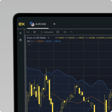
Look at the technical view
Execute your next move with confidence using a range of advanced technical indicators.
Types of chart patterns
There are three main types of chart patterns every trader should know: continuation, reversal, and bilateral (or neutral). Below is a breakdown of over 40 chart patterns, grouped by how they behave in different market conditions.
Continuation patterns
Continuation patterns are a core part of technical analysis. They signal that the existing trend—whether up or down—is likely to continue after a temporary pause. These continuation patterns often form during periods of consolidation when the market takes a breather before resuming in the same direction. Traders rely on these formations as continuation signals, giving them clues on where the price movement is headed next.
Some of the most common types of chart patterns in this category include flags, pennants, wedges, rectangles, and triangles. Recognizing these price patterns on a price chart helps traders make informed decisions, especially when setting a profit target or identifying entry points. These patterns tend to form in the middle of trends and are confirmed by a breakout accompanied by a strong closing price. Mastering continuation patterns allows traders to better identify patterns, anticipate future price movement, and build more confident strategies based on historical behavior. Among them, the symmetrical triangle is often considered the strongest chart pattern for trend continuation.
Bullish flag
The bullish flag pattern is a powerful bullish chart pattern and a classic example of a continuation pattern in chart pattern analysis. It forms after a sharp upward price move, known as the “flagpole,” followed by a brief period of consolidation where the price drifts slightly lower or sideways within parallel support and resistance lines. This consolidation forms the flag shape, resembling a small downward-sloping channel or rectangle on the chart. Despite the temporary pause, the prevailing trend remains bullish, and the pattern suggests that another strong upward move is likely to follow.
The psychology behind the bullish flag lies in market momentum. After a rapid rally, buyers often pause to absorb profits and reassess before pushing the price higher again. During this pause, volume typically declines, signaling a temporary equilibrium between supply and demand. When the price breaks above the upper resistance line of the flag, especially with rising volume, it confirms the continuation of the original uptrend.
This bullish chart pattern is especially useful for timing long entries in trending markets. Traders often measure the height of the flagpole and project that same distance upward from the breakout point to estimate the profit target. While the breakout may be sudden, conservative traders often wait for a retest of the broken resistance line for added confirmation.
Importantly, a failed flag, where the price breaks in the opposite direction, may indicate a weakening trend or false breakout, so risk management remains key. According to Johnson’s 2023 study, Continuation Patterns in Bull Markets from the Institute of Financial Analysis, bullish flag patterns have a 75% success rate in forecasting upward price breaks when formed during strong market trends.

Bearish flag
The bearish flag is a classic price pattern and one of the most recognizable chart patterns used in technical trading. It forms during a downtrend, following a sharp price drop—the “flagpole”—and is characterized by a brief consolidation in the form of a small, upward-sloping channel or rectangle. This consolidation phase typically moves against the prevailing trend, creating a temporary pause before the downtrend resumes. The pattern becomes actionable once the closing price breaks below the lower boundary of the flag, signaling a continuation of bearish momentum.
The structure of the bearish flag pattern is defined by parallel or slightly converging support and resistance lines, with lower volume often accompanying the retracement. This reflects short-term profit-taking or hesitation among sellers, rather than a true reversal in sentiment. When the breakout occurs to the downside, typically on stronger volume, it reinforces the bearish outlook and offers traders a clear opportunity to enter short positions in the direction of the dominant trend.
Traders often set price targets by measuring the length of the flagpole and projecting that distance downward from the breakout point. While brief, this pattern can be highly effective when confirmed by other indicators or market context.

Bullish pennant
The bullish pennant chart pattern is a classic bullish chart pattern that forms during a strong uptrend, representing a temporary pause before the upward momentum continues. This price pattern begins with a sharp rally, known as the flagpole, followed by a brief consolidation phase where price action contracts into a small symmetrical triangle. The consolidation occurs as traders take profits and the market cools off, allowing for a moment of balance between buying and selling pressures.
This pattern reflects market indecision, as both buyers and sellers pull back from aggressive trading. However, the overall sentiment remains bullish. The two converging trendlines forming the triangle demonstrate that the price is tightening and preparing for a breakout. Confirmation of the pattern occurs when the price breaks above the upper trendline with a spike in volume, signaling that buyers have regained control and are ready to push the price higher.
Traders often set a profit target by measuring the height of the flagpole and projecting that distance upward from the breakout point. Some conservative traders wait for a retest of the breakout level to confirm support before entering. The bullish pennant chart pattern is frequently used across asset classes—stocks, forex, and crypto—due to its reliability in forecasting continued bullish momentum.

Bearish pennant
The bearish pennant is a well-known bearish chart pattern used in technical analysis to signal the continuation of a price movement within a downtrend. It typically forms after a sharp decline, known as the “flagpole,” followed by a brief consolidation phase where the price moves within a small, contracting triangle. This consolidation reflects temporary indecision as selling slows and short sellers take profits. However, the pattern signals that downward momentum is likely to resume once the consolidation ends with a breakdown.
The internal structure of the pennant shows lower highs and higher lows converging into a triangle, supported by decreasing volume. This suggests that market participants are in a holding pattern, awaiting the next move. Once the price breaks below the triangle’s lower trend line, the bearish pattern is confirmed, and traders often look for continuation to the downside. Conservative traders may wait for a retest of the broken support, now acting as resistance, before entering a short position. A strong bearish candlestick at the retest can provide added confirmation.
Among the types of chart patterns available, the bearish pennant is part of the broader family of continuation patterns and is valued for its ability to offer precise entry points and profit targets. The projected target is often determined by measuring the height of the flagpole and applying that measurement downward from the breakout. According to a 2015 study published in the Journal of Applied Finance & Banking, bearish pennant patterns had a 71.3% success rate in predicting trend continuations in emerging markets.

Ascending triangle
The ascending triangle is a classic bullish continuation pattern widely used in technical analysis to anticipate breakouts during an ongoing uptrend. It is formed by a horizontal resistance line at the top and a rising trend line at the bottom, which converge to create a right-angled triangle. This pattern indicates growing buying pressure as the lows become progressively higher, even though the price repeatedly tests a consistent resistance level. The pattern is complete when the price breaks above the resistance line, ideally accompanied by increased volume.
This setup is especially valuable because of the way it visualizes market psychology. As the ascending triangle tightens, it shows that buyers are willing to step in at increasingly higher levels, putting pressure on the resistance. The pattern signals that a strong price movement is likely once that ceiling is broken. Many traders enter long positions just after the breakout, while conservative traders may wait for a retest of the former resistance level to confirm support. The ascending triangle is also used to estimate a profit target by measuring the height of the triangle and projecting it upward from the breakout point.
Because of its reliability, the ascending triangle is often considered one of the most effective continuation formations. In fact, Anderson’s 2023 study, Analyzing Continuation Patterns in Bull Markets, found that ascending triangle setups had a 75% success rate in predicting sustained uptrends across various asset classes.

Descending triangle
The descending triangle pattern is one of the most widely recognized continuation patterns in technical analysis. It typically forms during a downtrend and signals that the bearish momentum is likely to continue. It is defined by a horizontal support level and a descending trend line of lower highs, creating a triangle that narrows over time. This price compression illustrates mounting selling pressure as buyers fail to push prices higher. The pattern signals a strong likelihood of a breakdown below support, especially when accompanied by increased volume.
What sets the descending triangle pattern apart from other trading chart patterns is its structure, which reflects a battle between buyers attempting to defend a fixed level and sellers who are becoming increasingly aggressive. The repeated bouncing off the horizontal support suggests temporary buying interest, but each subsequent high is lower than the last, showing that the bulls are gradually losing ground. Once the price movement closes below the support level with conviction, the descending triangle pattern is confirmed and often leads to a sharp continuation of the downtrend.
Conservative traders may wait for a retest of the broken support (now acting as resistance) to ensure the breakout is valid. This approach reduces the risk of false breakouts and aligns with disciplined trading. Though the descending triangle pattern is most often seen during downtrends, it can occasionally form as a reversal pattern after an uptrend. However, for reversals, the ascending triangle pattern tends to be more relevant.
Among all trading chart patterns, the descending triangle pattern is one of the clearest representations of bearish control in the market. According to Trevor Davis’ 2023 study, Reversal Patterns in Bear Markets, conducted by the Market Analysis Institute, the descending triangle pattern demonstrated a 68% success rate in forecasting bearish continuations or reversals. Whether used in forex, stocks, or crypto markets, the descending triangle pattern remains a powerful tool for anticipating downward price movement and refining short-side strategies.
Check out our guide to triangle chart patterns if you would like to dive deeper into triangle formations and how to trade them effectively.

Bullish rectangle
The bullish rectangle pattern is a classic continuation pattern that appears during an uptrend, signaling a temporary pause before the prevailing bullish momentum resumes. It is formed when the price consolidates within a well-defined horizontal range, bound by flat support and resistance levels. This creates a rectangular shape on the chart, with the price oscillating between these two levels as traders digest prior gains and prepare for the next leg higher.
This sideways consolidation reflects a state of equilibrium in the market, where buyers and sellers are temporarily balanced. The bullish rectangle often shows multiple touches on both the support and resistance lines, indicating strong conviction at those levels. Although the price lacks direction during this phase, the continuation bias remains bullish as the pattern typically resolves with a breakout to the upside.
This pattern signals renewed buying interest when the price finally closes above the resistance boundary, often accompanied by increased volume. Traders often enter long positions at the breakout and use the height of the rectangle to project a profit target from the breakout point. While the price may occasionally retest the broken resistance as new support, the overall setup favors trend continuation in the direction of the original uptrend.
A bullish rectangle pattern is popular among traders who follow technical analysis because it offers clearly defined risk and reward parameters. This makes it an effective tool for identifying strong setups within a bullish environment.

Bearish rectangle
The bearish rectangle is a continuation pattern that forms during a downtrend, signaling a temporary consolidation before the bearish momentum resumes. It is characterized by the price moving sideways within a horizontal channel, bouncing between clearly defined support and resistance levels. This creates a rectangular shape on the chart, as the market temporarily pauses but fails to reverse direction.
Within the bearish rectangle, buyers and sellers are locked in a tug-of-war. Bulls attempt to push the price higher from support, while bears consistently cap the advance at resistance. The result is a period of indecision, but unlike a reversal setup, the prevailing trend remains dominant. The pattern is confirmed once the price decisively breaks below the lower support boundary, especially if accompanied by a volume increase.
Traders often watch for subtle signs of weakness during the consolidation, such as failed attempts to break resistance or slightly lower highs. These clues suggest bearish pressure is building. Once the breakdown occurs, the range of the rectangle can be measured and projected downward to estimate a profit target.
The bearish rectangle is widely used in technical analysis because of its clear structure and relatively high reliability in trending markets. It provides a disciplined framework for entering short positions, with well-defined risk and reward parameters. Though simple in appearance, this pattern reflects an important market dynamic: temporary balance giving way to renewed selling pressure.

Bullish wedge (Falling wedge in an uptrend)
A falling wedge pattern in an uptrend is a bullish continuation pattern that typically forms when prices consolidate within two converging downward-sloping trendlines. This pattern reflects a temporary correction or pullback during a broader uptrend. Volume usually decreases during this pattern as volatility contracts and market participants await a breakout. A close above the upper trendline, especially on increased volume, confirms the bullish setup.
This price pattern signals that, although sellers have been able to push prices lower, their strength is waning as the range tightens. The chart pattern suggests that buyers are gradually stepping in to absorb selling pressure, leading to an eventual breakout and continuation of the original upward trend. Traders often enter long positions after the breakout, with targets based on the height of the wedge projected from the breakout point.

Bearish wedge (Rising wedge in a downtrend)
This pattern occurs in a downtrend and signals continuation of the bearish move. Prices rise within two converging upward-sloping lines, forming a narrowing structure. A breakdown below the lower trendline confirms the pattern and suggests that sellers are regaining control.
The rising wedge often represents weakening buying momentum, as each push higher loses strength and volume fades. This gradual loss of bullish conviction allows bears to step in, setting the stage for a sharper decline. Traders commonly use the height of the wedge to estimate a profit target after the breakout.

Measured move (Up/down)
The measured move pattern consists of three parts: a strong trend move, a corrective phase, and another move in the same direction. For bullish patterns, the second move often matches the first in length. Traders can identify this by measuring the first trend leg and projecting it from the end of the correction. This price pattern is commonly seen in trending markets. The corrective phase often appears as a flag, pennant, or wedge, and traders look for volume to decline during the pause and rise again during the second leg. Confirmation of the pattern comes when the price resumes in the original direction with strong momentum.

Reversal patterns
These types of chart patterns suggest a potential change in the direction of the existing trend. Reversal patterns help traders identify when a prevailing trend might be coming to an end, allowing them to prepare for a possible shift in direction. These formations can occur after both uptrends and downtrends, and they often serve as early signals shifting market sentiment.
There are two main types of chart patterns in the reversal patterns category: bullish and bearish. A bullish reversal pattern indicates a shift from a downtrend to an uptrend, suggesting buyers are gaining strength. On the flip side, a bearish reversal pattern marks the transition from an uptrend to a downtrend, often driven by increasing selling pressure. Recognizing reversal patterns—whether they indicate a bullish (upward) reversal or a bearish (downward) reversal—is a key skill for anticipating significant trend changes. One popular bullish reversal chart pattern is the inverse head and shoulders, while the double top is a common example of a bearish reversal pattern.
Head and shoulders pattern
The head and shoulders pattern is one of the most well-known and reliable reversal chart patterns in technical analysis. It typically forms at the peak of an uptrend and signals a potential transition from bullish to bearish momentum. This pattern consists of three consecutive peaks: the first and third are the "shoulders," which are lower and approximately equal in height, while the middle peak forms the "head," the highest point in the pattern. A horizontal or slightly sloped neckline connects the lows of the two troughs between the shoulders and the head.
What makes the head and shoulders pattern significant in chart pattern analysis is the psychology it represents. The initial rally to the first shoulder reflects a typical market advance, followed by a temporary pullback. The strong move to the head indicates a final surge of buyer enthusiasm, but as prices fail to make a higher high on the third peak (the second shoulder), it becomes clear that buying pressure is weakening. Once the price breaks below the neckline with increased volume, the pattern is considered complete, confirming a downward reversal.
Traders use this breakdown point as an entry signal for short positions, often targeting a price move equal in height to the distance from the head to the neckline. The head and shoulders pattern is widely used across forex, stocks, and crypto markets due to its clarity and historical reliability. According to a 2009 study by Dr. Andrew Lo and Jasmina Hasanhodzic in the Journal of Portfolio Management, the head and shoulders pattern has a 65% success rate in identifying trend reversals across multiple asset classes. In the context of technical analysis, few patterns are as intuitively recognizable and psychologically grounded as the head and shoulders pattern.

Inverse head and shoulders
The inverse head and shoulders is a powerful reversal chart pattern that forms after a downward trend and signals a potential shift from bearish to bullish momentum. It consists of three troughs on a price chart: the middle trough, or “head,” is the lowest point, flanked by two higher troughs (the “shoulders”) on either side. This formation reflects a gradual weakening of selling pressure and increasing buyer interest. A trend line—called the neckline—is drawn across the highs between the troughs. When the price breaks above this neckline, the pattern signals a bullish reversal and potential start of a new uptrend.
In technical analysis, this chart pattern is widely respected for its clarity and reliability, particularly when volume increases during the breakout. Traders often use this pattern in combination with other indicators to confirm momentum and set a profit target based on the distance from the head to the neckline. The pattern's strength lies in how it visually maps market psychology: sellers dominate during the initial decline, stabilize during the second trough, and then lose control as buyers push the price higher at the third trough. Once the neckline is breached, the price movement typically accelerates upward, reversing the prior trend. Among the various types of chart patterns, the inverse head and shoulders stands out as one of the most consistent and trusted signals of a developing upward trend.

Double top pattern
The double top pattern is a bearish reversal pattern that forms after an uptrend. It features two peaks at roughly the same level, separated by a moderate dip. A drop below the interim low (neckline) confirms the pattern. This structure suggests that buying pressure has failed twice at the same resistance level, indicating weakening bullish momentum. Once the neckline is broken, sellers typically gain control, often leading to a sharp downward move. Traders often use the height between the peaks and the neckline to estimate the potential price target after the breakdown.

Double bottom pattern
The double bottom is a bullish reversal pattern that forms after a downtrend, indicating a potential shift in momentum from bearish to bullish. The double bottom pattern consists of two distinct troughs at approximately the same price level, separated by a moderate peak. A breakout above this peak confirms the beginning of a new uptrend.
Among classic types of chart patterns, the double bottom stands out for its simplicity and reliability, especially when accompanied by increasing volume on the breakout. As one of the most recognizable reversal patterns, the double bottom reflects a scenario where selling pressure weakens and buyers gradually regain control, paving the way for a trend reversal. Traders often use the height between the troughs and the peak of the double bottom to project a potential price target.

Triple top pattern
Similar to the double top pattern but with three peaks, the triple top pattern signals strong resistance at a particular price level. It's a stronger indication of a downward reversal, especially when followed by a breakdown below the support level. The repeated failure to break above the same resistance suggests that buyers are exhausted, increasing the likelihood of a trend shift to the downside. Traders often use the height from the peaks to the support line to estimate a potential downside target after the breakdown.

Triple bottom
The triple bottom is a bullish pattern characterized by three equal lows, which indicate a strong and repeatedly tested area of support. The pattern is validated when price breaks above the resistance level formed by the highs between the troughs. This breakout suggests that buyers have gained control after absorbing selling pressure multiple times. Traders often view the pattern as a reliable signal of an emerging uptrend, with a projected target based on the distance from the support to the resistance level.

Rounding top
The rounding top is a gradual reversal pattern that forms as buying pressure steadily fades, creating a smooth, dome-like shape on the chart. It often signals a transition from an uptrend to a downtrend as momentum shifts from buyers to sellers. This pattern is marked by slow, rounded price action rather than sharp peaks, reflecting uncertainty and weakening demand.
The breakdown typically occurs when the price closes below a key support level—often called the neckline—confirming the bearish reversal. Traders often measure the height from the top to the neckline to estimate a potential downside target. The slow formation gives traders time to prepare for the reversal, especially when paired with declining volume and bearish candlestick confirmations.

Rounding bottom
Also known as a saucer bottom, the rounding bottom is a bullish reversal pattern that marks a gradual shift from bearish to bullish sentiment. It resembles a smooth, curved “U” shape, indicating a period of accumulation after a prolonged downtrend. The pattern reflects a slow transition where selling pressure fades and buyers begin to cautiously step in.
Confirmation occurs when the price breaks above the resistance level—often referred to as the neckline—signaling that bulls have taken control. Traders often project the height from the bottom to the neckline as a target for the upward move. Volume typically increases on the breakout, adding credibility to the reversal.

Falling wedge (In a downtrend → bullish reversal)
In a downtrend, the falling wedge signals a possible bullish reversal. The pattern forms as price makes lower highs and lower lows within two converging downward-sloping trendlines. A breakout above the upper trendline is the entry point, indicating a shift in momentum from sellers to buyers.
This pattern reflects a gradual slowdown in selling pressure, where each successive low becomes less steep, and bearish strength begins to wane. Traders often view the tightening price range as a sign of accumulation. When the breakout occurs with rising volume, it confirms the bullish intent and can serve as a strong reversal signal. Price targets are typically projected using the height of the wedge added to the breakout level.

Rising wedge (In an uptrend → bearish reversal)
In an uptrend, the rising wedge pattern often suggests that a bearish reversal is approaching. The price moves higher within two converging, upward-sloping trendlines, creating a narrowing structure on the chart. A breakdown below the lower trendline indicates the uptrend is losing strength and that a reversal may be underway.
This pattern typically forms as bullish momentum fades, with each new high becoming less convincing than the last. Volume often decreases during the wedge formation, signaling weakening buyer conviction. When the breakdown occurs, especially with an increase in volume, it confirms that sellers have regained control. Traders often use the height of the wedge to estimate the potential downside target from the point of breakdown.

Island reversal
The island reversal is a rare but powerful reversal pattern that occurs when a gap up is followed by a period of sideways price movement, and then a gap down—or vice versa, in the case of a bullish setup. This sequence creates an isolated section of price action—an "island"—separated from the rest of the chart by two gaps in opposite directions. It typically signals a sudden and sharp shift in market sentiment.
This pattern reflects a rapid change in control between buyers and sellers, often driven by news or earnings surprises. The gaps serve as clear confirmation of the reversal, and the pattern is considered more reliable when accompanied by a volume spike during the second gap. Traders often use the price range of the island itself to set initial stop loss levels or measure potential targets.

Cup and handle
The cup and handle pattern is a bullish continuation pattern that resembles a teacup. The cup is the rounded bottom that reflects a gradual shift from selling to buying pressure, while the handle forms through a brief consolidation or pullback. The breakout from the handle signals the continuation of the uptrend and often leads to strong upward momentum. This pattern is widely used in both traditional and crypto markets due to its reliability. See how it is used in a bitcoin analysis here.

Inverted cup and handle
This bearish pattern, which is the counterpart of the cup and handle pattern, forms an inverted "U" shape, representing a gradual loss of upward momentum. The "handle" appears as a brief upward consolidation or pullback before the trend continues downward. A breakdown below the handle confirms the bearish continuation and suggests further price declines. Traders often use this pattern to anticipate short-selling opportunities, especially when volume increases during the breakdown.

Broadening top
The broadening top is a bearish reversal pattern identified by diverging trendlines that create a widening formation of higher highs and lower lows. This expanding structure indicates increasing market volatility and a lack of clear direction, often driven by emotional trading or uncertainty. As the swings become larger, the pattern signals instability and a weakening uptrend.
Eventually, the pattern resolves with a breakdown below support, confirming a shift toward bearish sentiment. Traders often use the widest part of the formation to estimate a potential price target after the breakout. This pattern tends to appear near market tops and is considered a warning of a potential trend reversal.

Broadening bottom
The broadening bottom pattern is the bullish counterpart of the broadening top formation. It appears after a downtrend and signals a potential reversal pattern. It is characterized by widening price swings—lower lows and higher highs—that reflect growing volatility and a battle between buyers and sellers. This chaotic structure indicates increasing market uncertainty, but also the possibility of a bullish shift.
A breakout above the upper resistance line confirms the reversal and suggests that buyers are gaining control. Traders often look for rising volume on the breakout and use the width of the broadening pattern to project a potential price target. This pattern is often seen as a sign of accumulation before a strong move upwards.

Pipe top
The pipe top is a rare but impactful reversal pattern that forms when two sharp peaks occur at nearly the same price level, creating a visual resemblance to parallel “pipes.” This pattern typically emerges after a strong uptrend and signals a sudden shift in market sentiment from bullish to bearish. The rapid formation suggests exhaustion among buyers and a potential trap for late entries.
Once the second peak fails to break new ground and price reverses sharply, aggressive selling often follows. Traders watch for confirmation with a strong bearish candle and increased volume, using the height between the peaks and the breakdown level to project a potential downside target. The pipe top pattern is especially common in highly volatile or news-driven markets.

Pipe bottom
The pipe bottom pattern is the bullish counterpart to the pipe top. This forms after a strong downtrend, characterized by two sharp, consecutive lows at approximately the same price level. This pattern suggests a period of capitulation, where sellers drive the price down aggressively before demand steps in to absorb the pressure. The sharp recovery following the second low indicates a potential bullish reversal.
The pattern often reflects panic selling followed by quick accumulation, making it a powerful signal of a sentiment shift. A breakout above the interim high between the two lows typically confirms the reversal, and traders may use the depth of the pattern to estimate a potential upside target. Like its bearish twin, the pipe bottom is more likely to appear in volatile conditions or around key news events.

Spike and ledge (Blow-off patterns)
The spike and ledge pattern—also known as a blow-off pattern—features a sudden and steep price spike followed by a tight, sideways consolidation zone called the “ledge.” This formation typically occurs after emotional or news-driven moves, where price accelerates rapidly and then stalls in a narrow range. The ledge reflects a pause where the market catches its breath, but underlying tension remains.
This pattern often ends with a sharp breakout in the opposite direction of the initial spike, as traders take profits or reverse their positions. The more extended and tight the ledge, the more explosive the reversal tends to be. It’s a high-volatility setup that requires careful timing, often confirmed by volume shifts or candlestick reversal signals.

Bump and run reversal
The bump and run reversal is a distinct reversal pattern that begins with a steep, unsustainable price advance or decline—the “bump”—followed by a more gradual price movement known as the “run.” This pattern highlights market exhaustion and often results in a sharp trend reversal once a key support or resistance line is broken. The initial bump reflects overextended price action driven by emotional buying or selling.
As the “run” develops, the slope flattens, signaling a loss of momentum. A decisive break through the trendline that supports the run phase confirms the reversal and often triggers a strong counter-move. This pattern is particularly effective for spotting tops and bottoms in highly directional markets.

Horn top/bottom
These patterns look like narrow horns, formed by a sharp move, brief consolidation, and then a breakout. A horn top signals a bearish reversal, while a horn bottom suggests a bullish reversal. They often occur at market extremes, where price rapidly accelerates, pauses briefly, and then sharply reverses direction. Traders typically look for volume confirmation and candlestick signals to validate the breakout.

Diamond top/bottom (Can be reversal or neutral)
A diamond pattern forms when the price initially broadens out with wider swings and then begins to contract, creating a diamond-like shape on the chart. It often signals a potential reversal, but depending on market context, it can also act as a neutral pattern if the breakout direction is unclear. Watch for volume confirmation to validate the breakout. A diamond top tends to break downward after a strong uptrend, while a diamond bottom typically breaks upward following a downtrend, offering traders versatile opportunities in both directions.

Bilateral/neutral patterns
Bilateral chart patterns are unique types of chart patterns in technical analysis because they do not clearly signal whether the next price movement will be upward or downward. These patterns represent a phase of market indecision, where buying and selling pressures are evenly matched. As such, bilateral patterns require confirmation before a trading decision is made, typically through a breakout accompanied by volume.
Common bilateral chart patterns include the symmetrical triangle, wedge pattern, and broadening formations. These setups are defined by trend line convergence or divergence and often emerge during periods of consolidation. While they don't provide directional certainty, they are essential tools in technical analysis, especially for traders who want to understand different types of chart patterns and anticipate breakouts. A breakout above or below the defining trend line often confirms the pattern's outcome. Whether dealing with a wedge or triangle, mastering these bilateral types of patterns can enhance a trader's ability to recognize potential breakout scenarios and make more informed, timely decisions in volatile market conditions.
Symmetrical triangle
The symmetrical triangle is a popular price pattern in technical analysis, representing a period of consolidation and market indecision. It forms when two converging trendlines—one descending from the highs and one ascending from the lows—compress the price into a tighter range. This balanced battle between buyers and sellers creates a coiled structure on the chart, often considered one of the most recognizable graph patterns. While the symmetrical triangle is often observed in trending markets and can act as a continuation pattern, it is technically a bilateral pattern, meaning it can break in either direction depending on momentum and volume.
The pattern becomes actionable once the price breaks through either the upper or lower trendline, ideally with rising volume to confirm direction. When it occurs during a downward trend, a break below the support may signal bearish continuation. In an uptrend, a break above resistance may indicate bullish momentum. However, traders should remain open to both outcomes and wait for confirmation before entering a position.
Because of its versatility and neutrality, the symmetrical triangle is used across various markets—forex, stocks, and crypto—and is especially helpful during periods of consolidation. According to Nate Anderson’s 2023 study, Continuation Patterns and Market Trends, conducted by the Technical Analysis Institute, symmetrical triangle formations had a 70% success rate in forecasting trend continuations when confirmed by volume and breakout direction.

Wedges (As neutral setups)
When not clearly part of a trend, falling or rising wedges can act as neutral setups, making them bilateral rather than directional patterns. The direction of the breakout determines whether the trade will be bullish or bearish, meaning you should wait for the breakout direction before entering. These wedge formations often signal tightening price action and declining volatility, creating a coiled market state. Traders typically look for a surge in volume and a decisive candle to confirm the breakout direction before committing to a position.
Diamond top and bottom patterns
Diamond top and diamond bottom patterns are generally considered bilateral patterns—meaning they can break out in either direction—but they are more commonly observed and used as reversal patterns.
This formation looks like a diamond due to expanding and then contracting price ranges. It may signal a sharp move in either direction. Traders watch the breakout direction for confirmation.
- Diamond top: Typically forms after an uptrend and often leads to a bearish reversal. However, if the breakout occurs upward (less common), it can signal trend continuation—hence, bilateral in nature but with a bearish bias.
- Diamond bottom: It usually appears after a downtrend and is commonly a bullish reversal pattern. However, it can also break downwards instead of upwards, making it technically bilateral, though bullishly biased.
Traders tip: Treat these patterns with caution and wait for a volume-confirmed breakout to determine direction.
Megaphone pattern (Expanding triangle)
The megaphone pattern, also known as the expanding triangle or broadening formation, is considered a bilateral pattern because it lacks a clear directional bias. Depending on market conditions, the price can break out either upward or downward. It forms through diverging trendlines with higher highs and lower lows, reflecting extreme volatility and market indecision.
This characteristic sets it apart from the broadening top and broadening bottom patterns, which have similar shapes but function as reversal patterns. A broadening top typically appears after an uptrend and signals a bearish reversal, while a broadening bottom forms after a downtrend and points to a bullish reversal. The key difference lies in context and intent: traders use the megaphone pattern to react to a confirmed breakout in either direction, whereas broadening tops and bottoms are used to anticipate a trend reversal based on prior movement.

Sideways channel (Horizontal range)
Price moves between horizontal support and resistance levels, creating a channel where the market trades in a range without a clear trend. This pattern reflects a temporary balance between buyers and sellers, with neither side gaining control. It can break out in either direction, making it a bilateral setup. Traders often monitor volume spikes and strong candlestick formations at the breakout point to confirm direction and reduce the risk of false signals.

Complex head and shoulders
A variation of the classic head and shoulders pattern, the complex head and shoulders features multiple shoulders or heads, creating a more irregular and extended formation. While it adds complexity and may take longer to form, it still signals a potential trend reversal depending on the breakout direction. Traders should pay close attention to neckline structure and volume behavior, as confirmation is often less straightforward than with the traditional version. Patience is key when trading this setup, as false signals can occur during its extended development.

Rectangle (In sideways markets)
This neutral pattern occurs during consolidation, where the price bounces between two parallel levels of horizontal support and resistance. Because there is no prevailing trend leading into the formation, the rectangle in sideways markets is considered a bilateral pattern as it can break out either upward or downward with equal likelihood. This contrasts with the bullish and bearish rectangle patterns, which form within established uptrends or downtrends and are classified as continuation patterns, implying a directional bias. In the sideways version, the market is directionless, often due to uncertainty or a pause in momentum, and traders must wait for a decisive breakout with volume confirmation before determining a trade direction. This makes the sideways rectangle a flexible but reactive setup, requiring confirmation rather than anticipation.
A rectangle (in sideways markets) and a sideways channel (horizontal range) are nearly identical in visual structure. The main difference lies in context and how traders interpret them:
- Rectangle (In sideways markets): This term is most often used in technical analysis when referring to a chart pattern with no clear trend leading into it. It's treated as a bilateral (neutral) pattern because the price could break out up or down with similar probability. It’s usually seen as a period of indecision or consolidation in a non-trending market.
- Sideways Channel (Horizontal range): This is a broader, more general term that describes price moving within horizontal support and resistance levels, regardless of the prior trend. It can occur within a trend (as a consolidation) or in a range-bound market. It's often more descriptive of current price behavior than predictive.

Broadening wedge
This pattern combines the characteristics of a wedge and a broadening formation, featuring diverging trendlines that create increasingly wider price swings. It reflects growing volatility and uncertainty, making price action harder to predict. Because it lacks a consistent trend direction and can occur in both uptrends and downtrends, the Broadening Wedge is considered a bilateral (neutral) pattern. This sets it apart from typical wedge patterns, like the falling wedge or rising wedge, which are usually tied to specific trend continuation or reversal outcomes. Similarly, unlike a broadening top or bottom, which have directional biases, the broadening wedge requires traders to wait for a confirmed breakout in either direction before taking action.

Volatility contraction pattern (VCP)
Popularized by traders like Mark Minervini, this setup shows progressively smaller price swings, indicating tightening volatility and a potential buildup of pressure. A strong breakout can follow, often marking the start of a sustained trend move. It can be identified by watching for contraction phases before a volume surge, as this signals that institutional interest may be entering. The key to trading VCPs lies in patience, waiting for a clean breakout from the final contraction point with strong volume confirmation.

Triangle with a false breakout
Sometimes, a price creates a false breakout or “fakeout” in one direction before reversing and breaking out in the opposite direction. These triangles are known for trapping early traders who act before confirmation. Look for failed breakouts and potential re-entry opportunities using volume to validate the true move. This pattern highlights the importance of patience and risk management, as false signals are common in periods of low conviction or algorithm-driven volatility. Recognizing the failed breakout can offer a strategic edge for contrarian entries.

Pennant with a fakeout
Similar to the triangle fakeout, a pennant may display a sharp but deceptive breakout in one direction before reversing and resolving in the opposite direction. These false moves often occur during periods of low volume or market manipulation. Patience and confirmation help avoid being trapped, especially by waiting for a sustained move backed by volume and clear price action. Identifying a fakeout early can also present a second-chance entry with improved risk-reward.
A pennant with a fakeout differs from a bullish or bearish pennant in both behavior and trade reliability. While traditional pennants are continuation patterns—bullish after an uptrend and bearish after a downtrend—the pennant with a fakeout is considered a bilateral (neutral) pattern because it does not confirm direction until after a deceptive move. This pattern often forms similarly to regular pennants but initially misleads traders with a false breakout in one direction, only to reverse and break out in the opposite direction. This deceptive action traps early entries and highlights the importance of confirmation through volume and price follow-through before entering a trade. See below for the key differences.
Bullish pennant:
- Forms after an uptrend.
- Consolidates briefly, then breaks upward.
- High-probability continuation when confirmed.
Bearish pennant:
- Forms after a downtrend.
- Consolidates, then breaks downward.
- Also directional and trend-following.
Pennant with a fakeout (Bilateral):
- Can form after any trend.
- Displays a false breakout first, then reverses.
- No reliable directional bias—traders must wait for a confirmed breakout.
- Bilateral because the outcome depends on which direction the real breakout occurs.
In summary, while bullish and bearish pennants are directional by design, a pennant with a fakeout is bilateral in nature and requires extra caution and confirmation, making it a more reactive than predictive setup.
Exness Trade app
Trade with confidence anytime, anywhere.
Common questions about types of chart patterns
How many types of chart patterns are there?
There are over 40 recognized types of chart patterns used in technical analysis. These patterns are generally grouped into three main categories: continuation, reversal, and bilateral (neutral) patterns. Each category contains multiple formations, ranging from the simple and most common chart patterns, like the double top, to more complex patterns such as the bump and run or volatility contraction pattern (VCP). While you don't need to memorize all of them at once, becoming familiar with the core patterns can help you make smarter and faster decisions in the market.
Which chart pattern is best?
There’s no single “best” chart pattern, it depends on the context, the market you're trading, and your personal trading style. That said, some of the most reliable patterns include the head and shoulders, cup and Handle, and symmetrical triangle formations. These tend to have higher success rates, especially when confirmed with volume and other technical signals. The key is to combine pattern recognition with risk management and timing rather than relying on any single pattern alone.
Key takeaways
- There are over 40 types of chart patterns, grouped into three core categories: continuation patterns, reversal patterns, and bilateral (neutral) patterns. Each offers insights into potential price direction.
- Continuation patterns such as flags, pennants, wedges, rectangles, and triangles signal that the prevailing trend is likely to continue after a pause, helping traders align with momentum.
- Reversal patterns indicate a change in trend direction. Bearish reversals often follow uptrends (e.g., double top, and head and shoulders), while bullish reversals emerge after downtrends (e.g., inverse head and shoulders and double bottom).
- Bilateral patterns like the symmetrical triangle, broadening wedge, and rectangle in sideways markets have no clear directional bias and can break out up or down, requiring traders to wait for breakout confirmation.
- The bullish flag and bearish flag are highly reliable continuation setups. They mirror the psychology of momentum pauses and breakout resumption, especially when supported by volume surges.
- Complex setups, such as the bump and run reversal and volatility contraction pattern (VCP), reveal deeper insights into price exhaustion and accumulation before a trend reversal or breakout.
- Visual cues, such as converging or diverging trendlines, horizontal channels, or cup-and-handle shapes, are central to identifying different types of chart patterns and understanding market sentiment.
- Not all patterns are purely directional. Pennants with fakeouts and triangles with false breakouts demonstrate the importance of waiting for confirmation instead of reacting to early, deceptive moves.
- Historical studies show success rates of several chart patterns, such as the ascending triangle and head and shoulders patterns, have statistically significant success rates in forecasting future price movement when used with proper technical analysis.
- Mastering different types of chart patterns can elevate your trading strategy, providing structured frameworks for entry, stop-loss placement, and profit targeting across markets like forex, stocks, and crypto.
Final thoughts
Understanding the different types of chart patterns is essential for any trader aiming to make informed and confident decisions. Whether you’re trading breakouts, spotting reversals, or waiting for bilateral setups to confirm direction, these patterns offer a visual edge in reading market behavior. But theory alone isn’t enough, you need to put your knowledge to the test. Practice identifying and trading chart patterns in real market conditions using a risk-free demo account with Exness, and sharpen your skills before committing real capital.
Share:
Related


Exness Trade app
Trade with confidence anytime, anywhere.


Get the app
App title

Trading is risky. T&Cs apply.

